Website Design and Development: The Complete Guide for Modern Brands
How serious brands plan, design, build and maintain a website — from discovery and information architecture through design systems, engineering, performance, accessibility and post-launch iteration.
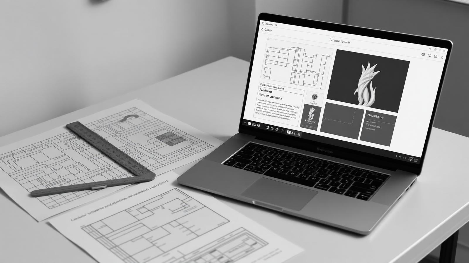
A website is the only brand asset that every audience touches: customers, candidates, partners, investors and journalists all arrive at the same set of pages. That makes it the highest-leverage thing most organisations own — and the easiest to get wrong, because it sits at the intersection of brand, content, product design, engineering and marketing. This guide sets out how a modern website is planned, designed, built, launched and improved, in the order the work actually happens.
It is written for founders, marketing leads and product owners who are commissioning a site rather than building it themselves. You should finish it able to write a better brief, ask sharper questions of any studio or in-house team, and recognise the difference between a site that looks current and a site that will still be working in three years.
1. Start with a decision, not a design
Every website exists to help a specific person make a specific decision. Buy this. Book a call. Apply for this role. Trust this company enough to shortlist it. Before anyone opens a design tool, that decision should be written down in one sentence per audience. It becomes the test every later choice is measured against: does this section, animation, form field or paragraph move someone closer to the decision, or is it there because a competitor has one?
The most common failure in website projects is not bad taste. It is a site that is technically competent and visually pleasant but has no argument — a homepage that says what a company does without saying why it should be believed, followed by service pages that describe process instead of outcome. An argument is the deliverable. Layout is how the argument is paced.
Write the argument as a short chain: who the visitor is, what they currently believe, what you want them to believe instead, and what evidence closes the gap. Evidence is concrete — named clients, numbers you can defend, a case study, a demo, a specimen of the work. If a claim has no evidence behind it, either find the evidence or cut the claim. This discipline is also what keeps a site honest, and honesty is now a ranking and reputation factor, not just an ethical one.
2. Discovery: the questions that change the outcome
Discovery is not a formality. It is where the expensive mistakes are prevented. A focused discovery phase for a mid-sized site takes one to three weeks and produces a single document that everyone signs off before design begins.
- Audiences and their decisions — ranked, not listed. A site optimised for three equally weighted audiences is optimised for none.
- Commercial model — how revenue actually arrives. A site that supports a six-month enterprise sales cycle looks nothing like one that supports self-serve checkout.
- Competitive set — not to copy, but to identify the conventions your audience already understands and the ones worth breaking.
- Content reality — who will write and maintain the content after launch, and how much of it exists today.
- Technical constraints — existing CRM, analytics, payment, ERP or booking systems that the site must integrate with.
- Success measures — the two or three numbers that will tell you in six months whether this was worth doing.
Content reality deserves particular attention because it derails more projects than any other factor. Design that assumes rich case studies, product photography and specialist copy will stall if nobody is resourced to produce them. Establish early whether you are designing for the content you have or commissioning the content you need — and if it is the latter, start that work in parallel with design, not after it.
3. Information architecture: the part users feel but never see
Information architecture is the structure of the site: what pages exist, how they nest, what each is called, and how someone moves between them. It is decided before visual design because it determines what visual design has to solve. Get it right and navigation feels invisible. Get it wrong and no amount of typographic polish will rescue it.
Three rules carry most of the weight. First, name pages the way your audience names things, not the way your org chart does — 'Solutions' is a compromise between departments; 'Warehouse automation' is a page someone can search for. Second, keep the primary navigation to a number a person can hold in mind, typically five to seven items. Third, make every important page reachable within two clicks of the homepage, because depth is where content goes to be forgotten.
Dynamic sections — case studies, articles, products, locations — need a template plan rather than a page plan. Decide what fields each item has, which are required, and how the listing filters and sorts. This is where a site becomes maintainable or becomes a liability: a case study template with clear slots can absorb thirty new projects; a set of hand-built pages cannot.
Finally, plan URLs at this stage. Clean, stable, human-readable paths are cheap to define now and expensive to change later. If you are replacing an existing site, map every old URL to a new one and prepare permanent redirects before launch — losing accumulated search equity is the single most avoidable cost of a redesign.
4. Content design comes before visual design
Layout designed around placeholder text produces a site that looks excellent in a presentation and falls apart when real words arrive. Content design — writing the actual headlines, subheads, body copy, labels and button text against the page structure — should run ahead of or alongside visual design.
Practical guidance for the writing itself: lead each page with the claim rather than the context; keep sentences short enough to be scanned; write in the second person when instructing and the first person plural when committing to something; and use the words your customers use in enquiries and sales calls, which are usually plainer than internal language. Headlines should still make sense if every image fails to load — that is a good proxy for both clarity and accessibility.
Microcopy carries disproportionate weight. 'Submit' is a form action; 'Send my brief' is a description of what happens next. Empty states, error messages, confirmation screens and form hints are where a brand either sounds like a person or sounds like software. Draft them deliberately rather than leaving them to whoever builds the component.
5. Visual design and the case for a system
Visual design translates the argument into hierarchy, pace and personality. The strongest sites tend to be restrained: a confident typographic scale, generous space, a small palette used decisively, and imagery that is specific to the business rather than bought from a library. Distinctiveness comes from commitment to one direction, not from adding more.
Whatever the direction, it should be built as a system rather than a set of pages. A design system for a website is modest in scope but transformative in effect: colour and typography tokens, a spacing scale, a grid, and a library of reusable sections — hero, feature row, statistic band, testimonial, card grid, form, footer. New pages are then composed from known parts, which keeps a growing site coherent and dramatically reduces the cost of the fifth, tenth and fiftieth page.
- Type scale: three or four sizes for headings, one or two for body, one for small print. More sizes than that is usually indecision.
- Colour: define semantic roles (surface, ink, muted, line, accent) rather than raw colour names, so themes can change without rewriting components.
- Spacing: a single numeric scale used everywhere; inconsistent padding is the most visible sign of an unsystematic build.
- Components: each section defined with its content limits — maximum headline length, image ratio, number of items — so content and design never fight.
6. Responsive design as a first-class deliverable
Most audiences now meet a brand on a phone first. Treating mobile as a compression of the desktop layout produces the familiar result: cramped headlines, tiny tap targets, horizontally scrolling tables and hero sections that push all meaningful content below the fold. Design at least two layouts deliberately — a narrow one and a wide one — and treat the tablet range as a decision rather than an accident.
Specific things worth deciding at design time: how navigation collapses and what the open menu contains; how multi-column sections reflow; which images are cropped differently at narrow widths; what the minimum tap target is; and how long forms are segmented. Also decide what is removed on mobile — a decorative animation that costs 400KB of JavaScript is a different proposition on a phone on cellular data.
7. Engineering: choices that determine the next three years
The build stack should follow from the site's requirements, not from fashion. The practical questions are: does content need to be edited by non-technical people, does the site need to render on the server for search and social sharing, does it need authenticated areas or a database, and how much traffic must it absorb without falling over.
For most brand and marketing sites, a modern component-based framework with server rendering, a content source the team can edit, and deployment to a global edge network covers the requirements comfortably. Marketing sites that add product features later benefit from a stack that can serve both — a single codebase with server functions, authentication and a database avoids the eventual split between 'the website' and 'the app', which is where design consistency usually dies.
Whatever is chosen, insist on a few non-negotiables: semantic HTML as the foundation, components that map to the design system, no hard-coded colours or spacing outside the token layer, typed data structures for repeatable content, and content that is data rather than markup. Each of these is a small discipline during the build and a large saving during every later change.
8. Performance is a design constraint, not a phase
Performance cannot be sprinkled on at the end. It is determined by decisions made in design — how many fonts, how heavy the imagery, how much motion, how much third-party script the marketing stack demands. Treat a page-weight budget as part of the brief and hold design and engineering to it jointly.
- 1.Images: serve modern formats, size them for their container, always set explicit dimensions to prevent layout shift, and lazy-load everything below the fold.
- 2.Fonts: two families at most, subset to the characters you use, self-hosted and preloaded, with a metrics-compatible fallback so text is readable immediately.
- 3.JavaScript: ship the minimum needed for interactivity; render content on the server so the first view does not depend on a bundle downloading.
- 4.Third parties: audit every tag. Analytics, chat widgets, heatmaps and pixels are frequently the single largest source of slowness on an otherwise fast site.
- 5.Motion: prefer transforms and opacity, keep durations short, and honour reduced-motion preferences.
Measure with real-user data as well as lab tools. A site can score well in a synthetic test on a fast connection and still feel slow on a mid-range phone. The Core Web Vitals — loading, interaction responsiveness and layout stability — are a reasonable proxy for felt quality and are used in search ranking, which makes performance both a user and an acquisition concern.
9. Accessibility: the baseline, not the extra
An accessible site is one that works for people using keyboards, screen readers, magnification, voice control, or simply reading on a bright day. It is a legal requirement in many markets, a large commercial audience everywhere, and — usefully — almost perfectly aligned with good engineering practice.
- Colour contrast that meets WCAG AA for body text and interface elements, checked in design rather than discovered in audit.
- A logical heading order with exactly one H1 per page, so structure is navigable without sight.
- Every interactive element reachable and operable by keyboard, with a visible focus state you designed rather than one the browser guessed.
- Real semantic elements — buttons that are buttons, links that are links, labels bound to inputs, landmarks for navigation and main content.
- Descriptive alternative text for meaningful images and empty alt attributes for decorative ones.
- Motion that respects the reduced-motion preference, and no content that depends on hover alone.
Automated tooling catches perhaps a third of issues. The rest is found by tabbing through the site without a mouse and listening to a page with a screen reader — an hour of manual testing per template is a realistic and worthwhile budget.
10. SEO built in rather than bolted on
Search visibility is mostly the by-product of decisions already covered: a clear structure, real content that answers real questions, fast pages, semantic markup and stable URLs. What remains is deliberate and finite.
- A unique title and meta description per page, written for a human scanning results rather than for a keyword counter.
- Self-referencing canonical URLs so duplicate paths do not compete with each other.
- Open Graph and Twitter metadata so shared links render as intended.
- Structured data that matches the page type — Organization sitewide, Article on posts, Product or Service where relevant, BreadcrumbList on deep pages.
- An accurate sitemap that reflects the routes that actually exist, and a robots file that does not accidentally block anything important.
- Internal links between related pages, which distribute authority and, more importantly, help people find the next useful thing.
Content strategy is the slower half. Ranking for terms with commercial intent generally requires genuinely useful pages — comparisons, guides, worked examples, pricing explanations — maintained over time. One substantial article that answers a question completely outperforms six thin ones that gesture at it.
11. Quality assurance before launch
A pre-launch checklist should be written down and executed by someone other than the person who built the site. At minimum: every template reviewed at narrow, medium and wide widths; every link and form tested including failure states; metadata verified page by page; analytics and conversion tracking confirmed with test events; redirects from the old site verified in bulk; 404 and error pages designed and working; and a genuine content proofread by someone who has not read the copy fifteen times.
Test on real devices where possible, including an older mid-range Android phone, which is a far better representation of your audience than the latest hardware on the team's desks.
12. After launch: the part most projects skip
A website is not a deliverable, it is a system that decays. Content goes stale, browsers change, dependencies need patching, and the business moves. Budget for it: a modest recurring allowance for maintenance and iteration will preserve more value than the same money spent on another redesign in two years.
Establish a small measurement habit rather than a dashboard nobody opens. Review the two or three success measures from discovery each month, look at the pages with the highest traffic and the highest drop-off, read the enquiries that come through the contact form, and make one improvement. Compounded over a year, that is a materially better site — and unlike a redesign, it is informed by evidence rather than opinion.
The best websites are not the ones that launched perfectly. They are the ones that were improved deliberately, in small increments, by a team that kept looking.
13. What to look for in a partner
If you are commissioning the work, judge a studio on the questions it asks before it shows you anything. A team that opens with your commercial model, your audiences and your content reality will produce a more useful site than one that opens with a mood board. Ask to see a case study end to end — the problem, the decisions, the trade-offs and what happened afterwards — rather than a gallery of screens.
Ask specifically how they handle accessibility, performance budgets, content editing after handover, and what the site will be like to extend in a year. The answers reveal whether you are buying a design or a system.
A short summary
- 1.Define the decision each audience needs to make, and the evidence that closes the gap.
- 2.Run a real discovery phase; resolve content reality before design.
- 3.Fix information architecture and URLs first.
- 4.Write the content against the structure before designing around it.
- 5.Design a small system, not a stack of pages.
- 6.Treat responsive layouts, performance and accessibility as design constraints.
- 7.Build on semantic HTML with tokens, typed content and server rendering.
- 8.Handle SEO fundamentals during the build, not after.
- 9.Test with a written checklist on real devices.
- 10.Fund iteration; review evidence monthly and improve one thing at a time.
Our case studies document the decisions behind each build — structure, design system, engineering and outcome.
See how this works in practice