UX vs UI Design: What the Difference Means for Your Project
UX and UI are not two names for the same craft. Understanding where one ends and the other begins changes how you brief, hire and review design work.
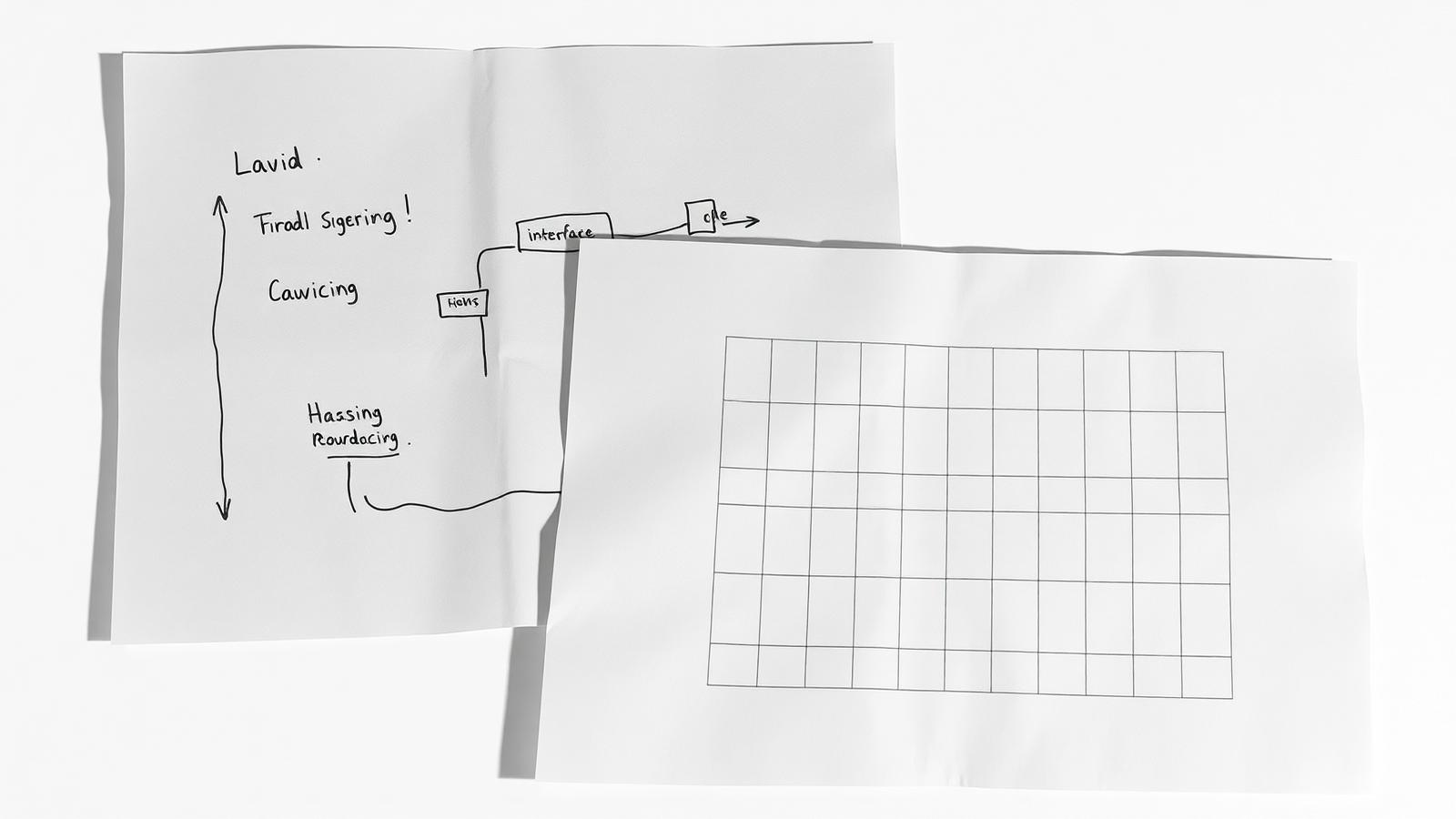
The terms are used interchangeably in job adverts and briefs, which causes real problems: teams hire for one and expect the other, and projects arrive at beautiful interfaces that solve the wrong problem. The distinction is worth getting right because it determines what you should ask for and how you should judge what comes back.
The short version
UX design decides what happens. UI design decides what it looks and feels like when it happens. UX is concerned with structure, sequence, logic and the shape of the problem; UI is concerned with hierarchy, form, typography, colour, motion and the quality of every state. One without the other fails predictably: strong UX with weak UI feels crude and untrustworthy; strong UI with weak UX feels attractive and useless.
What UX design actually decides
- Who the user is and what they are trying to accomplish, expressed as tasks rather than demographics.
- The flow — the sequence of steps between intent and outcome, and everything that can be removed from it.
- Information architecture — what exists, what it is called, how it nests, how it is found.
- The content model — what data each object holds, which parts are essential, and what happens when they are missing.
- Edge cases — empty states, errors, permissions, slow connections, partial data. This is most of the real work.
- Interaction logic — what a control does, when it is disabled, what feedback confirms it worked.
Typical deliverables are user flows, sitemaps, wireframes, content models and prototypes for testing. They are deliberately unpolished, because polish invites feedback on aesthetics when the question on the table is structure.
What UI design actually decides
- Visual hierarchy — what the eye reaches first, second and third on every screen.
- Typography — the scale, weights, measure and rhythm that make dense information readable.
- Colour and contrast — semantic roles, states and accessible combinations.
- Layout and spacing — grid, density, alignment, and the space that gives content its status.
- Components and their states — default, hover, focus, active, disabled, loading, error, empty.
- Motion — what transitions communicate, how long they take, and when they should not happen at all.
Typical deliverables are a design system, high-fidelity screens for every state, specifications for behaviour and responsive rules, and assets ready for engineering. The unit of work is the component, not the screen — which is what makes the output extendable.
Where they overlap — and why the overlap matters
The border is genuinely blurry, and that is fine. Whether a form is one long page or three steps is a UX decision with heavy UI consequences. Whether an error message appears inline or at the top is a UI decision with heavy UX consequences. The overlap is best handled by the two disciplines working in the same room on the same problem, not by drawing a firmer line.
What matters is that both decisions are made deliberately by someone accountable for them. Most bad interfaces are not the result of bad taste; they are the result of a decision nobody made.
How this changes your brief
- 1.Describe the outcome, not the artefact. 'Reduce the number of enquiries that need three clarifying emails' is a brief. 'Redesign the contact page' is a task.
- 2.Ask for the structural work to be shown before the visual work. If the first thing you see is a polished screen, the structure was assumed.
- 3.Review in the right mode. Wireframes are reviewed for logic and completeness; visual designs are reviewed for hierarchy, tone and craft. Mixing the two wastes both.
- 4.Require states, not screens. A design that shows only the ideal case is half a design.
- 5.Insist on a system. Whatever the size of the project, components with defined states are what keeps it coherent after handover.
How to tell which one your project is missing
If users cannot find things, abandon flows midway, or ask questions the interface should have answered, the gap is UX. If the product works but feels cheap, inconsistent or untrustworthy, if spacing and type sizes vary page to page, or if states look unfinished, the gap is UI. If enquiries arrive but they are the wrong enquiries, the gap is upstream of both — it is positioning and content.
The practical conclusion
Treat UX and UI as one continuous process with two kinds of decision, sequenced so that structure is settled before surface. Brief for outcomes, review structure and surface separately, demand every state, and expect a system rather than a set of screens. That is the difference between design that survives contact with real content and design that photographs well.
Our engagements run structure first, then surface, then a system engineering can build from.
How we work